Experience!
How do you craft a digital experience for your consumers? BY providing them a robust, stable, highly efficient digital platform, but have you thought that 80% of the digital experience is driven by the way UI/UX has been designed. Neo Banks aka challenger banks that are 100% digital, the UI/UX weighs a lot more in terms of customer satisfaction and conversions. What are my reasons?
- NeoBanks UI/UX are gateways to digital banking. If your user does not find the design principle in place, the banks, firms, and NBFC’s would have to face Abandonment, Deactivation, or Deletion of accounts.
- UI/UX experience decides the future of the platform. While getting services do you find it more appealing when the executive is charming enough or with a straight face he/she is doing his job. Similar is the case with UI/UX in the neo banking platform. The font, color coding, placing of action buttons heavy/light text, design principles all of it can decide if customer would stay or abandon it; after all, avoiding a bad experience is the best thing.
Welcome to the world of UI driven Banking – Neo Banking!
My post of today would talk about Neo Banks and the importance of UI/UX. If you are looking to understand Neo Bank and its basics, visit my post here on different use cases of Neo Banks, visit my post here and Neo Banks in India, check here.
Neo Banks and UI/UX
If we look at the top strategic priorities for financial institutions in 2018 and 2019 – Improving Digital Experience for consumers is the top voted one.
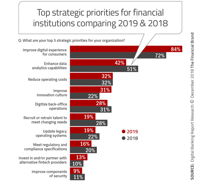
Source – The Financial Brand
The stats reflect the idea or inclination of Financial Institutions to offer their customers, but are they able to match the customer’s expectations?
Neo Banks UX – Where they fail?
You Offer a Bouquet, but Customers choose one
Banking is not just funds transfer; there are hundreds of services available for each entity on this earth. No one needs all of them, so catering to each customer experience is a must. Be specific, and show only that to the user.
While for you Banking may sound simple, many people do not understand the How Banks work, and the maths behind it, so flooding them with all types of services is like closing a prospective lead.
Neo Banks that offer digital banking experience need to keep their focus on the customers they are targeting and highlight the same in the app or website.
Simplify rather than complicating
The below data highlights a significant factor on “How one should craft the digital experience for the customer.“ The digital experience should mimic what they have been doing, rather than confusing them.

Imagine when you go to a bank and apply for a loan in three steps; recreating the same step 1, step2 and step 3 should be the motive while designing the UI for a neo bank. Adding another step to the sequence might confuse him.
One needs to build a Neo Bank UX around customers and deliver services in a simpler way.
Options to suit the customer needs
In the age of Baby Boomers, Millennials, GenZ you cannot have one solution for all, so say Millennials are fine in sharing their personal data, but Baby Boomers are reluctant, an option of sign up from social media and a sign up from email would satisfy both the generation.
Flawed Digital Experience
What happens when someone promises you to show a dinosaur, but in reality, it’s the picture of dinosaur? That’s exactly what customers feel when the workflow in buggy; there are technical glitches, or even the device compatibility is not taken care.
The below text shows, on what happens when customers face such situation – they abandon you and go to your competitors.


How to Offer “Best Banking Experience” with a Neo Bank?
Identify Target Audience
The first step is always “Who,” as we discussed, there are 100 of banking services, but not everyone needs all of them. SO pick who your customer is? Would it be business owners? Or students? Or homemakers? Or women? Build a persona of such a person, so that as soon he/she lands on your app they can connect to it.
If possible, identify the lead actor/actress of your drama. Give him/her a name, use it as your chatbot or a virtual individual who is interacting with your prospective leads. Remember Fido Dido of Seven-Up? Or Zoo-Zoos from Vodafone? They didn’t exist unless they were named and published for users to connect to. So try it out.
How you resolve the pain points
Do you recollect how you were able to gel-up when you met your peer in a conference or on a flight? People tend to get bonded when they are sailing in the same boat. So if you can convince your customers that the issues or pain points are resolvable, they could connect with you instantly.
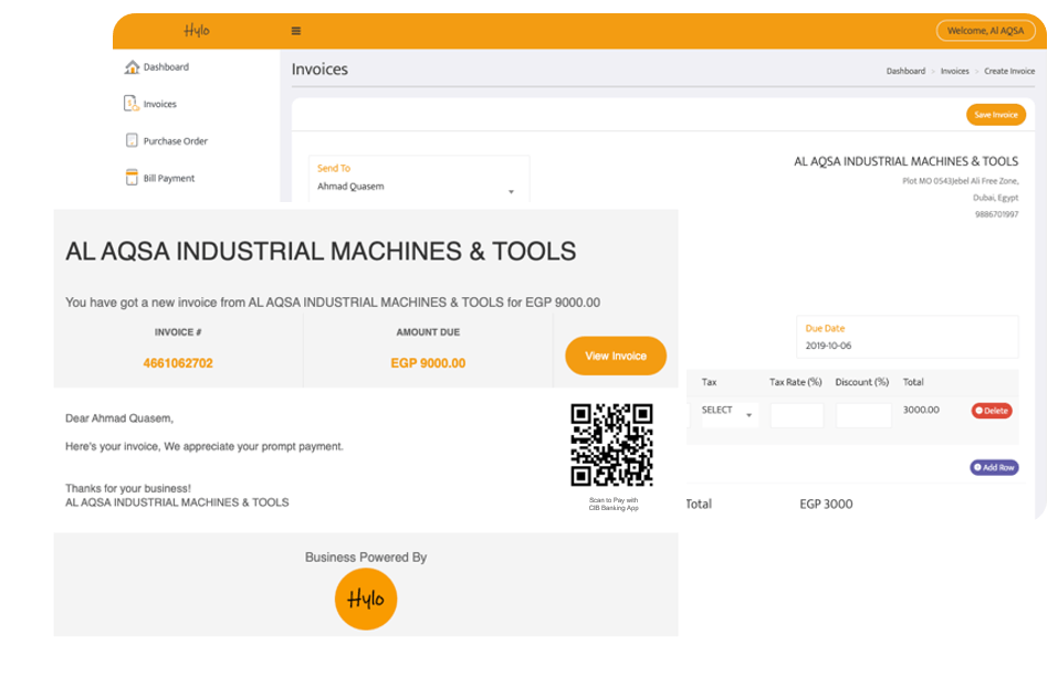
Use these pain points to draft a story that the characters can connect to. For example, Hylo who is addressing SME’s pain points, highlight in crisp manner how adopting digital channels could simplify payments.

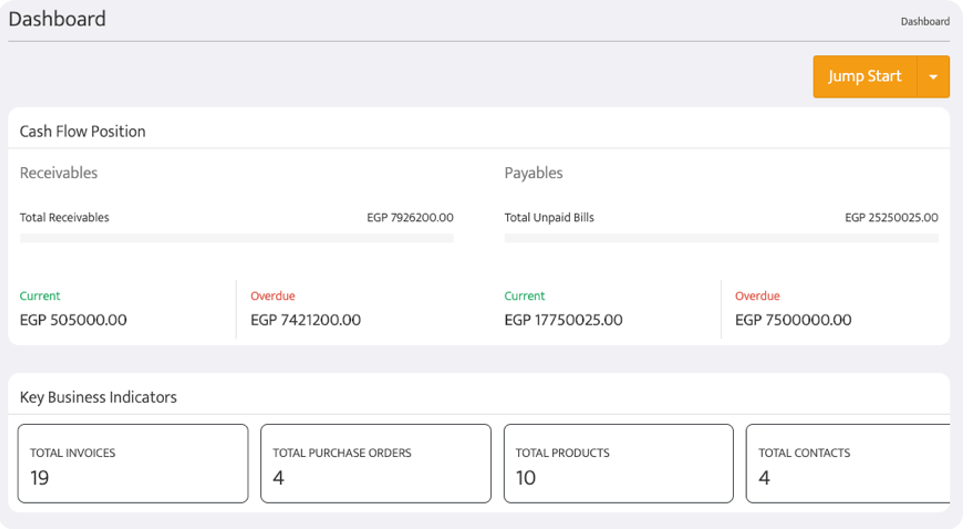
Draft the Footprints
On a journey where do you foresee users would like to navigate? Say an SME is looking for inventory management and he could be looking for answers like
- Would upload inventory details be a manual process or upload is available?
- What would the reorder point?
- How many rows/data could be entered?
- Does it work for multiple locations?
So he may be interested in getting
- A video/ppt helping with a sample product list
- FAQ’s covering point 2,3 and 4 from above.
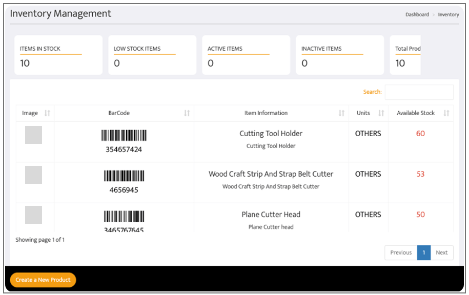
Hylo Inventory Management
Identifying the footprints help in streamlining the journey of the customer.
Remember the Neo Banking features should convey that they are innovative, smooth, precise, fast, and secure. Just as Hylo specified the different options for payments against invoice and a CTA of Collect Payment.
Connecting the dots
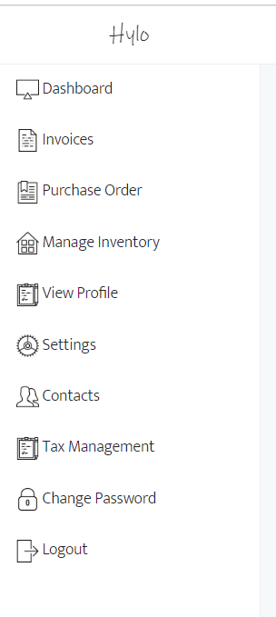
Once you have different modules available, now combine these modules to form the navigation workflow of the customer. Make sure to keep it minimum and straightforward.
Just for example, for an SME what all services he would need to receive an automated payment?
- Raise an invoice
- Send it to the buyer
- Different payment modes like online, cheque or cash
- Reminders
- Real-time notifications
- Ability to add your bank details
The Blueprint
Now is the time to finalize fit in all, i.e., text, images, CTA, colors, font into different screen sizes and get the blueprints ready. The major hurdle is getting all integrated into one screen, picking an example here – say your Neo Bank allows biometric authentication on a touch screen phone. It might be easy for a mobile app. But offering the same experience on a touchless desktop could be nothing like a nightmare.
Just to conclude, the UX should aim to offer a digital banking service influenced by human-centered design. What are your thoughts on UI/UX of a Neo Bank? Looking forward to hearing from you…
If you a Bank or NBFC looking to use technology and innovation in expanding the business and enable Neo Banking or Challenger Banking, we are here for you.
Teknospire, a fintech firm offers a Bank-in-a-box solution with omnichannel, agent/digital branches capability. The 360-degree banking solution reduces the CAPEX for a bank to set up a physical branch, but yet opens doors to expand their business. Our Neo Banking, Mobile Banking, and Agent Banking solution could help regional banks and cooperative banks to push Banking beyond physical walls. For details, please contact us here
Watch out this space to get more insights on Neo Banking. For my previous posts, please visit our blog.